Mission Control for Commercial Contractors
BRAND KIT
v2.9 — May 2026
- 01 Introduction
- 02 Brand Strategy
- 03 Voice & Tone
- 04 Logo
- 05 Sub-Brands
- 06 Typography
- 07 Color
- 08 Photography
- 09 Graphics
- 10 Iconography
- 11 Motion
- 12 Applications
How to Use This Kit
This is the definitive reference for how BuildOps shows up in the world — every color, typeface, graphic element, voice principle, and usage rule in one place. Whether you're writing copy, designing a campaign, building a slide deck, or briefing a vendor, this kit is where you start.
Strategy
Who we are, what we stand for, and the principles that guide every decision.
Voice
How we sound — tone principles, channel guidance, writing rules, and language examples.
Identity
Logo, sub-brands, typography, color system, photography, and the complete graphic toolkit.
Execution
Motion, AI language, feature naming, boilerplates, swag, and application templates.
The precision system — chevrons, markers, patterns — isn't decoration. It's the visual language of an AI that measures, calibrates, and operates with technical discipline. Every element in this kit exists to reinforce a single idea: this is technology built by people who understand the work.
Brand Strategy
Purpose, Mission & Values
Purpose
To serve the unsung heroes of the trades.
Mission
To build the agentic system of action for commercial contracting, where contractors run the strongest, smartest, most profitable version of their business.
Values
Act like an owner · Make customers win · Be bold
Four Brand Pillars
Forged for Commercial
We're wired for the complexity, pace, and pressure of commercial contracting — because we've lived it.
Firing on All Cylinders
Every part of the operation works in rhythm — nothing siloed, nothing disconnected, everything driving the same outcome.
Sharper with Every Job
We learn from everything we do. Every job, every interaction, every cycle makes the operation — and the company — smarter than the last.
Raising the Standard
Commercial contractors deserve better — better technology, a stronger workforce pipeline, and an industry that matches their importance.
Voice & Tone
Voice Overview
We sound like someone who's been on a job site — not someone selling software from a boardroom. We talk like we've seen the work, respect it, and know how to move it forward. Confident, calm, grounded in experience.
What Our Voice Sounds Like
BuildOps voice is rooted in field experience. We're not trying to be funny or clever. We're trying to be clear, direct, and real. A contractor reading our copy should feel like they're talking to someone who understands their pressure, respects their time, and has solutions that actually fit their work.
Core Voice Traits
- Direct. No hedge language. Say what you mean.
- Grounded. Examples from the field, not theory.
- Confident. We know what we're built for and we own it.
- Human. Contractions. Short sentences. Real rhythm.
- Respectful. The trades built this country. We talk like it.
Voice Principles
| Principle | Description | We Say | Not |
|---|---|---|---|
| Clarity Over Cleverness | We write like we build: with purpose. Every line should earn its place. | "Get the job done right, faster." | "Streamline your operations for optimized efficiency." |
| Respect the Work | The trades are the backbone of modern life. We talk to them like peers. | "You build the world. We help you keep the work moving." | "We're revolutionizing construction." |
| Grit with Heart | Confident, but not loud. Tough, but not cold. From a place of experience. | "Built from real jobsite experience." | "Innovative solutions designed to drive synergies." |
| Precision in Every Word | Specific beats vague. Data and detail. | "From quote to cash, all in one system." | "A single platform for all your needs." |
Tone Across Channels
Same voice, different energy. Here's how our tone shifts by channel — but the core respect and clarity stay constant.
| Channel | Tone Guidance |
|---|---|
| Website & Ads | Direct, confident, field-tested. Speak to results, not features. Lead with what matters to the contractor. |
| Conversational and real. Like a quick check-in from someone who knows the job. Short sentences. Value up front. | |
| Blog/Articles | Teach and tell stories. Use the field as the classroom. Show the thinking behind what we build. |
| Social/LinkedIn | Quick, scroll-stopping insight. Never corporate. Show real data. Respect people's time. |
| Executive Comms | Clarity, not theater. Grounded in lived experience. Show confidence through specifics, not superlatives. |
Writing Guidelines
Sentence Structure
Short beats long. Lead with what matters. If you're tempted to use a semicolon, consider breaking it into two sentences instead.
Word Choice
Plain English. Verbs over adjectives. "Cut paperwork" not "reduce documentation burden." "Work smarter" not "actualize optimal productivity."
Rhythm
2-4 line paragraphs. Read aloud. Use contractions. We're not writing legal documents — we're having a conversation with someone who's busy.
Grammar
AP Style. Sentence case headlines — unless the font (Söhne Schmal) demands all caps. No terminal punctuation in headlines (unless it's more than one sentence or a question). Mid-headline punctuation like commas and em dashes is fine — no ending period. Spaces around em dashes. Product names in proper case (BuildOps, not buildops or BUILDOPS). Oxford commas. No spaces before punctuation.
Data & Proof
Back up claims with proof points. Never say "industry-leading" or "best-in-class." Instead: "Contractors using BuildOps cut quote times by 60%." Specific beats vague every time.
Human Touch
Real, clear, direct. Examples from the field. Real numbers. Real names when we can share them. Show the work. Show the thinking.
Do's & Don'ts
When you're tempted to use these words, consider the alternatives instead. We're building a voice, not collecting buzzwords.
| Avoid | Say Instead | Why |
|---|---|---|
| Optimize | Cut the busywork / Work smarter / Run tighter | Optimize is consultant speak. Contractors want results, not jargon. |
| Streamline | Simplify / Shorten / Remove steps | Same reason. Be specific about what's being removed. |
| Seamless | Connected / All in one place | Contractors know integration is hard. "Seamless" feels like false advertising. |
| Transform | Change / Build / Move forward | Too grandiose. We're making work easier, not transforming industries. |
| Processes | Workflows / Jobs / Routines | Contractors live in workflows and jobs. "Process" sounds like MBA speak. |
| Efficiency | Faster / Less waste / Fewer steps | Show the result, not the concept. What actually changes? |
| Ensure | Keep / Make sure / Guarantee | "Ensure" is formal and distant. We sound like peers. |
| Actionable strategies | Next steps / Real takeaways | Nobody wants "actionable strategies." They want to know what to do. |
| Professional results | Real results / Work that lasts | If it's shoddy, calling it professional doesn't change it. |
| Leverage | Use / Apply / Build on | Business cliché. Be direct about what you're doing. |
| Revolutionize / Disrupt | Lead / Improve / Push forward | We're not disrupting anything. We're building what contractors need. |
| Continuum / Ecosystem | System / Platform / Network | Fancy words for simple ideas. Keep it simple. |
| Transform the industry | Raise the standard | Humbler. More honest. Shows respect for existing work. |
| Optimize workflows | Cut the paperwork | Show what actually changes. Who cares about optimization? They care about less paperwork. |
| Efficiency gains | Time back / Less waste | Contractors want time back in their day. That's what matters. |
Voice in Action
These examples show our voice across different contexts.
| Context | Yes | No |
|---|---|---|
| Website Headline | "Built for Action." | "Revolutionizing Operations for the Modern Contractor." |
| Ad Copy | "Work smarter. Get paid faster. Keep crews moving." | "Optimize your service management with cutting-edge automation." |
| Email Subject | "The easiest way to get paid on time." | "Discover new strategies to enhance operational efficiency." |
| Blog Intro | "Jobs are piling up. Crews are stretched thin. Here's how the best shops are staying ahead." | "The construction landscape is evolving at an unprecedented rate." |
| Social Post | "Fewer clicks. More work done. That's what we call progress." | "BuildOps helps you streamline your workflows for maximum profitability." |
| Customer Story | "B&L Glass cut quote times from days to hours — and never looked back." | "B&L Glass leveraged BuildOps to transform their business operations." |
| Exec Quote | "We built this platform the way we'd build anything that matters — with the right people, the right tools, and pride in the work." | "At BuildOps, we're revolutionizing how contractors operate." |
AI Language Do's & Don'ts
Language about OpsAI shapes perception. Speak to contractor value, not technical features. Be direct and concrete.
Do: Say "OpsAI" as proper noun
Always capitalize and use as a single word: OpsAI. Never "our AI," "the AI system," or "AI."
Don't: Use generic modifiers like "AI-powered"
Too vague. "AI-powered" says nothing about what it does.
Do: Say "intelligence built into the workflow"
Describes where the AI operates: inside the work itself.
Don't: Say "leverages machine learning"
Technical jargon. Contractors don't think in ML terms.
Do: Say "OpsAI flags what matters" or "surfaces recommendations"
Active, contractor-centric language. OpsAI works for them.
Don't: Say "continuously learns through advanced algorithms"
Too abstract. Show the benefit, not the mechanism.
Do: Say "the system gets sharper with every job"
Tangible outcome: better results over time.
Don't: Use "purpose-built AI solution for construction"
Corporate speak. Contractors want to know what it does for them.
Logo
Logo Origin
The BuildOps name and logo are inspired by the founder's experience in the United States Army. The three-stripes mark is reminiscent of the stripes an officer wears on their arm, indicating their rank of sergeant. However, those stripes are flipped upside down to look like an office building in isometric perspective. The stencil treatment of "Ops" is an additional on-the-ground, military reference.
Why This Matters
The logo isn't just visual identity. It's a reminder of where BuildOps comes from — military precision, built infrastructure, and a respect for hierarchy and leadership. The inverted stripes suggest something purposeful and grounded. The connection to rank suggests mastery and earned authority.
When you're using this logo, you're tapping into that heritage. This is a mark built for people who build things. It carries the weight of real work and real experience.
The mark also carries something quieter: service. The chevron comes from military service. The tradespeople who use BuildOps — HVAC technicians, plumbers, electricians — work in the service trades. And the best contractors run their businesses in service to their crews. Three meanings, same mark. None of them accidental.
Primary Lockup — Horizontal
The default and preferred expression. Use whenever space and layout allow.
Primary Lockup Rule
Use this horizontal lockup as the default across all digital and print applications. The spacing between mark and wordmark is fixed and should never be altered.
The horizontal lockup combines the three-stripe mark with the BuildOps wordmark. This is the most recognizable form. It works on light and dark backgrounds. The mark and type should always be treated as a locked unit — never separate them, never reposition, never scale disproportionately.
Secondary Lockup — Stacked
For centered compositions or limited horizontal space.
When to Use Stacked
The stacked lockup is ideal for social media avatars, small-format applications, or any design where the horizontal lockup won't fit. Never rotate or adjust the proportions.
The stacked lockup positions the type below the mark. This is the second choice — use it only when horizontal space is constrained or when centered composition calls for it. The mark and wordmark remain locked together as a unit.
Stripes Mark (Icon Form)
Shorthand symbol. Use sparingly in constrained spaces or where brand is already established.
Use with Care
The stripes mark is a symbol, not a full logo. Only use it when the BuildOps wordmark has already been established in the same piece or on the same page. Don't use it as a primary identifier.
What It Is
The stripes mark is the three-stripe symbol extracted from the full logo. It works in isolation for small spaces — social media icons, app badges, email signatures, favicons.
What It's Not
It's not a replacement for the full logo. It doesn't stand alone as the primary brand mark on a page or document. Use it as accent and reference — not introduction.
Logo Colorways
The logo exists in four approved colorways: Full Color, White Letters + Green Chevron, All Black, and All White. Use these. Don't create new combinations.
Full Color
White Letters + Green Chevron
All Black
All White
Four Approved Colorways
These are the only logo versions approved. All other color combinations are prohibited. When in doubt, use Full Color on Light.
⬇
Download Logo Files
All approved logo formats (SVG, PNG, RGB, CMYK) are available on Google Drive: BuildOps Logo Files
Clearspace & Minimum Size
Clearspace Rule
Use the width and height of the stripes mark as minimum surrounding space. This gives the logo room to breathe and prevents it from feeling cramped.
Mark height = Minimum clearspace
Horizontal lockup clearspace
Stacked lockup clearspace
Stripes mark clearspace
Minimum Size
Horizontal lockup: Never display smaller than 120px wide.
Stacked lockup: Never display smaller than 100px wide.
Stripes mark alone: Never display smaller than 40px square.
On Digital
For web and app use, scale in multiples of 2px (120px, 140px, 160px, etc.) for crisp rendering on standard and high-density displays.
Logo Misuse
These are the most common mistakes. Don't do them.
Do Not Recolor the Logo
The logo has four approved colorways. Creating new color combinations dilutes the brand. If you need a different version, reach out to the brand team for guidance.
Do Not Split the Mark from the Type
The stripes and wordmark are locked together as a unit. Never separate them in the same composition. Exceptions: the stripes mark may be used alone as a social media avatar or app icon where the full lockup has already been established in context. The Bracket Chevron is a standalone graphic element — it is not derived from the logo lockup and may be used independently.
Do Not Place on Insufficient Contrast
If the logo disappears into the background, it's wrong. Test every application. The white version needs dark backgrounds (not light gray). The dark version needs light backgrounds.
Do Not Stretch or Distort
Lock the proportions. Never squeeze horizontally, stretch vertically, or apply perspective transforms. The logo is designed as a perfect unit.
Do Not Rotate
The logo is designed to sit horizontal. Rotating it confuses the mark and damages the brand.
Do Not Use Outdated Versions
If you find an old BuildOps logo, don't use it. This version (v2.7) is the only approved version. All prior versions are retired.
Do Not Add Effects
No shadows, glows, strokes, or effects. The logo is designed to be simple and clean. Any addition cheapens it.
When in Doubt
If you're unsure about a logo application, ask. It's better to confirm than to publish something wrong. The brand depends on consistency.
Sub-Brands
Sub-Brand Overview
The BuildOps brand extends through a three-tier sub-brand system. Each tier has its own visual rules — typography weight, separator treatment, and badge eligibility.
Tier System Overview
| Tier | Role | Pattern | Weight | Separator |
|---|---|---|---|---|
| Tier 1 | Platform Pillar | BuildOps | Name | Inter Bold (700) | Pipe "|" |
| Tier 2 | Module | BuildOps Name+ | Inter Semibold (600) | "+" suffix (no pipe) |
| Tier 3 | Program/Community | BuildOps Name or Name | Inter Medium (500) | None |
Pipe Rule
If it could be a tab in the product navigation — it's Tier 1 and gets the pipe. If it's a feature within a pillar, it's Tier 2 with the plus. If it's a community or program, it's Tier 3 with neither.
Typography Weight Hierarchy
The weight progression mirrors the visual importance of each tier. Heavier weights signal platform-level prominence; lighter weights signal programs and communities.
| Element | Typeface | Weight | Use |
|---|---|---|---|
| BuildOps Logotype | Custom Lettering | — | Bespoke master brand mark |
| Tier 1 Name | Inter | Bold (700) | Closest visual weight to logotype |
| Pipe Separator | Inter | Light (300) | Thin vertical rule between brand and pillar |
| Tier 2 Name | Inter | Semibold (600) | One step lighter than Tier 1 |
| "+" Suffix | Inter | Semibold (600) | Optional Precision Green color |
| Tier 3 Name | Inter | Medium (500) | Lightest tier weight |
| Badge Label | Martian Mono | Regular | ALL CAPS, tracked out, Tier 3 only |
Tier 1 — Platform Pillar Logos
01
Platform Pillars
Pipe separator · Inter Bold (700) · Could be a tab in the product navigation
Tier 1 logos use the BuildOps mark with a pipe separator and the pillar name in Inter Bold. These are official designer lockups — use as provided, do not recreate in text.
BuildOps | Service
Horizontal
Vertical
BuildOps | Projects
Horizontal
Vertical
BuildOps | OpsAI
Horizontal
Vertical
"AI" renders in Focus Green (#19D979). See OpsAI Special Case page for full usage rules.
BuildOps | FinancialOS
Horizontal
Vertical
BuildOps | Sales & Marketing
Horizontal
Vertical
Tier 2 — Module Logos
02
Modules
"+" suffix · Inter Semibold (600) · A feature within a pillar
Tier 2 logos use the BuildOps mark with a "+" suffix. No pipe separator.
BuildOps Fleet+
Horizontal
Vertical
BuildOps CRM+
Horizontal
Vertical
Tier 3 — Program & Community Logos
03
Programs & Communities
No separator · Inter Medium (500) · Standalone identity within the family
Program and community logos are the lightest tier — no pipe, no "+". They stand closer to standalone identities while staying visually connected to the BuildOps family.
Certified Partners
Horizontal
Vertical
Pro Builders
Horizontal
Vertical
OpsAI — Special Case
Color Split Treatment
OpsAI receives a special color treatment: "Ops" in parent text color, "AI" in Focus Green (#19D979). Focus Green is the designated AI color — brighter and more energetic than Precision Green, it signals intelligence and forward momentum within the operational context.
OpsAI
OpsAI icon in Focus Green
Naming Convention
Always use proper case: OpsAI. Never write it as:
- OPSAI (all caps)
- Ops AI (two words with space)
- opsai (lowercase)
- ops-ai (hyphenated)
When to Use the Color Split
Use the Focus Green color split in marketing and highlight contexts where the AI distinction is strategically important. Focus Green (#19D979) is brighter than Precision Green and reserved specifically for AI-related elements. For product navigation and core documentation, use uniform color matching the background.
Rule
OpsAI is always one word, always proper case. The AI component is highlighted in Focus Green (#19D979) — our designated AI color — when the distinction serves the narrative.
Feature Naming & Tier Framework
Naming Convention
Core features (Quotes, Invoicing, Time Tracking) carry no sub-brand. They're foundational.
When does a feature graduate? When it could be its own navigation tab in the product. At that moment, it becomes Tier 1 or Tier 2.
Tier Decision Framework
Tier 1: Is it a primary pillar of the platform?
If yes: Could contractors navigate to this as a main section? Does it have its own set of workflows? → BuildOps | Name (with pipe)
Tier 2: Is it a feature within a pillar?
If yes: It's a module or tool nested under a broader function. → BuildOps Name+ (no pipe)
Tier 3: Is it a community, program, or certification?
If yes: It's outside the core product. → BuildOps [Name] or [Name] (no separator)
When in Doubt
🏷️
Ask the BuildOps brand team. Tier decisions shape long-term coherence. Better to confirm than to launch with the wrong designation.
Typography
Söhne Schmal
Söhne Schmal is our hero headline typeface. Bold, condensed, all-caps — it demands attention and sets a commanding tone.
SÖHNE SCHMAL
Usage Rules
- Weight: Fett (Bold) only
- Case: ALL CAPS always
- Limit: Maximum 7 words per headline
- Frequency: Use sparingly — never two headlines in the same document
- Hierarchy: Reserve for primary marketing messages only
Specimens
AI THAT SPEAKS CONTRACTOR
THE FUTURE OF THE TRADES
🔒
Licensed Font — Brand Team Access Required
Söhne Schmal is a premium typeface from Klim Type Foundry. Contact the brand team for license access and font files. Do not source it independently.
Approved Substitute: Bebas Neue
When Söhne Schmal cannot be loaded — Google Slides, Greenhouse, external platforms, email clients — use Bebas Neue (Regular weight) as the approved substitute. Same role: display headlines, ALL CAPS. Never use Bebas Neue when Söhne Schmal is available.
fonts.google.com/specimen/Bebas+Neue
Inter
Inter is the workhorse of the BuildOps brand. It powers body copy, captions, buttons, and sub-brand names. The variable font approach gives us precision at every weight.
Inter
Weight Range
Light (300): The quick brown fox jumps over the lazy dog
Regular (400): The quick brown fox jumps over the lazy dog
Medium (500): The quick brown fox jumps over the lazy dog
Semibold (600): The quick brown fox jumps over the lazy dog
Bold (700): The quick brown fox jumps over the lazy dog
Extra Bold (800): The quick brown fox jumps over the lazy dog
⬇
Free Download — Google Fonts
Inter is an open-source variable font available for free: fonts.google.com/specimen/Inter
Martian Mono
Martian Mono is a technical accent typeface. Use it for eyebrows, callouts, badges, and captions. It brings a precise, data-driven feel to layouts.
MARTIAN MONO
Weights Used
- Extra Light — Subtle, minimal contexts
- Light — Standard eyebrow weight
- Medium — Badge and strong callout
Rules
- Case: Typically ALL CAPS with tracking
- Frequency: Use sparingly for maximum impact
- Pairing: Always with Inter body copy
⬇
Free Download — Google Fonts
Martian Mono is open-source and free to use: fonts.google.com/specimen/Martian+Mono
Typesetting Specifications
These specifications govern text styling across all BuildOps applications and marketing materials.
| Element | Typeface | Weight | Case | Tracking | Leading | Size |
|---|---|---|---|---|---|---|
| Eyebrow | Martian Mono | Regular | Uppercase | +30% | 100% | 6% of viewport |
| Hero Headline | Söhne Schmal | Fett (700) | Uppercase | -1% | 80% | 100% of viewport |
| H1 Headline | Inter | Extra Bold (800) | Sentence Case | -4% | 100% | 36% of viewport |
| Subheading | Inter | Extra Bold (800) | Sentence Case | -3% | 120% | 36% of viewport |
| Body Copy | Inter | Light (300) | Sentence Case | -3% | 100% | 16% of viewport |
| Captions | Inter | Light (300) | Sentence Case | -3% | 100% | 8% of viewport |
| Buttons | Inter | Regular (400) | Title Case | +3% | 100% | 11% of viewport |
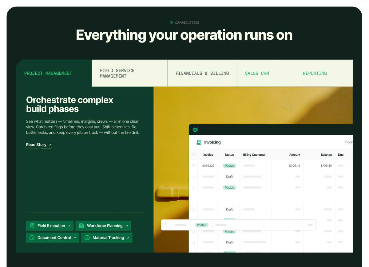
Web Typography in Action
This example demonstrates how the typography system supports clear page flow and intuitive scanning. Strong headlines anchor each section, while secondary titles and body copy establish a predictable rhythm that guides readers from high-level messages to supporting detail.
Generous spacing, staggered text layouts, and a clear typographic hierarchy work together to create pages that feel structured, easy to navigate, and flexible across variable widths.
Martian Mono
Used sparingly as a hairline style for metadata, labels, and utility moments
Inter
Set large for primary H1 headlines to create consistent visual anchors, as well as body copy and CTAs to balance hierarchy with readability
Web Typography — Extended
A second layout showing how the same typographic system scales across different page structures — with bolder section headers, longer-form titles, and more complex content hierarchies.
Martian Mono
Used sparingly as a hairline style for metadata, labels, and utility moments
Inter
Set large for primary H1 headlines to create consistent visual anchors, as well as bold H2s, longer titles, body copy, and CTAs to balance hierarchy with readability
Color
Core Palette
Five colors define the BuildOps brand. Each has a specific role and proportion in the visual system.
White
Primary background
#FFFFFF • RGB(255,255,255)
Weathered White
Blocks and accents
#FBFFED • RGB(251,255,237)
C0 M0 Y8 K5
Pantone 9064C
Grounded Green
Dark sections, footers, contrast
#12221C • RGB(18,34,28)
C93 M33 Y68 K85
Pantone 627C
Precision Green
Accents, icons, highlights
#00AF66 • RGB(0,175,102)
C93 M0 Y100 K0
Pantone 347C
Ops Orange
CTA buttons and accent only
#FFAE11 • RGB(255,174,17)
C0 M31 Y98 K0
Pantone 1235C
Expanded Palette — Shades & Tints
Supplementary colors for accessibility, hover states, and layering.
Weathered White Shades
#F2F6E5
WW Shade 1
#E8EDDC
WW Shade 2
#D6DCCC
WW Shade 3
#646F65
WW Shade 4
Grounded Green Shades
#112D22
GG Shade 1
#0E3E2B
GG Shade 2
Accent Extensions
#061100
Midnight Green
#19D979
Focus Green
Color Ratios
These proportions guide color distribution across different application types. They keep the visual experience balanced and prevent color overload.
Website
30% White — Primary background
14% Weathered White — Accent blocks and cards
2% Focus Green — AI indicators
6% Precision Green — Accents and CTAs
48% Grounded Green — Contrast and structure
Marketing & Campaign
14% White — Clean breaks and breathing room
12% Weathered White — Supporting surfaces
2% Focus Green — AI indicators
6% Precision Green — Highlights and focus
66% Grounded Green — Dominant, commanding tone
Note
These are guidelines, not rules. Context determines application. Campaigns emphasizing boldness lean darker; educational material may distribute lighter.
Web Color Usage
The web color palette leads with White at 30%, supported by Weathered White at 14% — together they make up nearly half the composition and establish a clean, readable foundation. This lighter base sets web apart from campaign work, which leans more heavily into darker, saturated brand elements.
Grounded Green dominates the other half at 48%, providing contrast, structure, and visual weight. Precision Green (6%) adds brand-level accent and emphasis, Focus Green (2%) is reserved exclusively for OpsAI and AI indicators, and Ops Orange handles CTAs and attention signals.
More important than maintaining exact ratios on a page-by-page basis is how color is used to shape the experience. Sections and layouts should be broken up through intentional shifts in color, shade, and tint — creating pages that feel dynamic, scannable, and easy to digest without losing cohesion.
Campaign Palette
The palette prioritizes Dark Green as the dominant color, establishing visual weight and a strong, high-contrast backdrop for key elements. Off-White, a new addition to the system, introduces subtle warmth and should be applied primarily to typography and graphic components as the secondary color. Green is reserved for highlights, used sparingly to emphasize precision graphics and borders.
Examples
In this example, Dark Green serves as the dominant color, providing a strong foundation and high-contrast backdrop for other elements. Off-White is applied primarily to typography, ensuring clarity and legibility against the darker base. Green is reserved for accents — such as borders and graphic details — reinforcing BuildOps' core brand color and adding visual energy.
To demonstrate flexibility within the system, Off-White may also take on a greater percentage of the palette. This approach allows photography to carry more of the visual weight, while Green continues to serve as a precise highlight that anchors the brand.
Color Do's & Don'ts
Do: White is the primary background
Use pure white (#FFFFFF) for main content areas. Weathered White is reserved for supporting blocks and accents.
Don't: Don't use Weathered White as full background
Full-page Weathered White backgrounds dilute hierarchy and feel flat. Reserve it for cards, callouts, and secondary surfaces.
Do: Use Precision Green at half the frequency of Grounded Green
Strong color should pop. If Grounded Green dominates, Precision Green becomes a punctuation mark, not a pattern.
Don't: Don't oversaturate with Precision Green
Too much green loses its accent power. It should feel like a surprise, not the norm.
Do: Ops Orange is CTA and accent only
Use for call-to-action buttons, highlights, and critical attention signals. Never as a background or dominant color.
Don't: Invent New Greens
Only use the approved greens above. If a color doesn't match one of the five brand values, it's not on-brand.
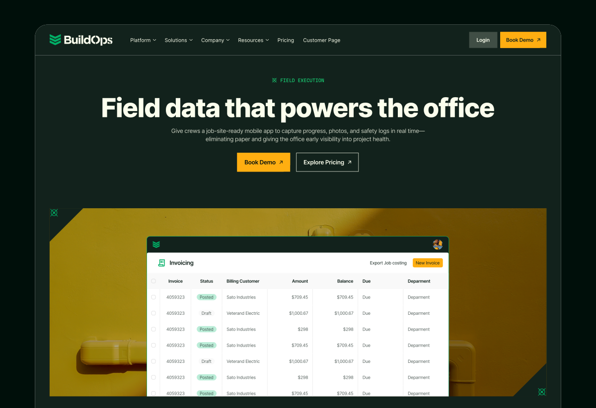
Photography
Photography
BuildOps photography features real job sites, authentic fieldwork, and genuine contractors at work. Never staged or stock.

Graphic Overlay 01 — Applied
White version over photography

Graphic Overlay 02 — Applied
White version over photography
Photo Library & Overlay Access
📷
The approved photo library and Photographic Overlay source files (Figma) are maintained by the brand team. Contact the brand team for access to photography, overlay templates, and design support. All photography must be reviewed and approved before use in external materials.
Photographic Overlays
Two overlay styles frame photography with technical precision. Available in green and white versions — use green on lighter photos, white on darker ones.
Overlay System
Each overlay is available in green and white. Use white on darker photos, green on lighter ones.
Graphic Overlay 01 — Green
Thin dashed lines + circle precision markers at corners
Graphic Overlay 02 — Green
Side rulers with outward hash marks + C01 coordinate labels
Graphics
The Precision System
Every line has a coordinate.
Every mark has a purpose.
Every pattern is earned.
BuildOps graphics aren't decorative. They're built on the same logic as the platform itself — measurement, structure, and precision applied to real work.
The system operates at two levels:
Foundational Graphics
The Clipped-Corner Shape and Pace-Setting Stripes define structural identity — containers, framing, layout rhythm. These appear everywhere the brand lives.
Precision Graphics
Chevrons, markers, measurement lines, coordinate labels, and patterns — the campaign-level detail layer. This is where the brand's technical character comes through most visibly.
Together they communicate something specific: this company operates with the kind of rigor contractors recognize from their own work. The chevron comes from the logo. The measurement marks reference real coordinate systems. The patterns emerge from those marks repeating at scale. Nothing is arbitrary.
The pages that follow document every element — its purpose, approved colorways, usage rules, and the restrictions that keep the system disciplined.
Foundational Graphics
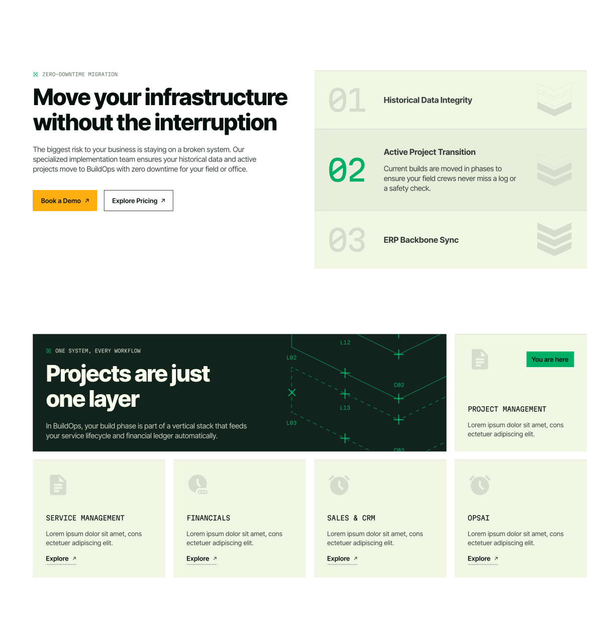
Inspired by the Stripes Mark, BuildOps is grounded in two foundational graphics: the Clipped-corner shape and the Pace-setting Stripes. One brings structure. The other brings momentum. Together, they create a flexible system that scales across brand moments — from simple layouts to bold compositions. The following pages define their usage.
Clipped-Corner Shape
Structure and precision
Pace-Setting Stripes
Momentum and direction
Brand Team Access Required
Foundational Graphics are maintained as Figma source files. Contact the BuildOps brand team for resources, permissions, and design support.
Clipped-Corner Graphic
The clipped-corner graphic is a foundational element of the BuildOps visual system. Corners are cut at a precise 45-degree angle with sharp points, reinforcing the brand's focus on accuracy and control. This treatment establishes a distinctive, technical edge that should be applied consistently across layouts to maintain visual cohesion.
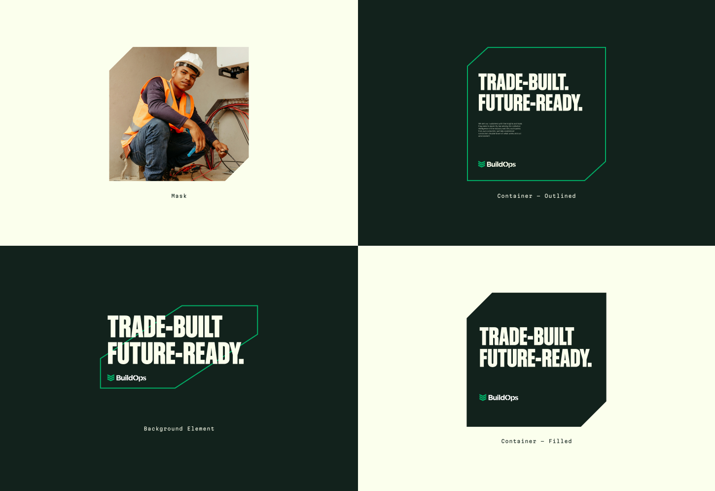
Mask
Use the clipped-corner mask to frame photography and tie imagery into the BuildOps system.
Container — Outlined
Use outlined containers when a lighter, more restrained emphasis is needed.
Background Element
A supporting background element used to add structure and emphasis to key messages. The 45° angle may be adjusted to align with the composition.
Container — Filled
Use filled containers to create bold focal points for short, high-impact messages.
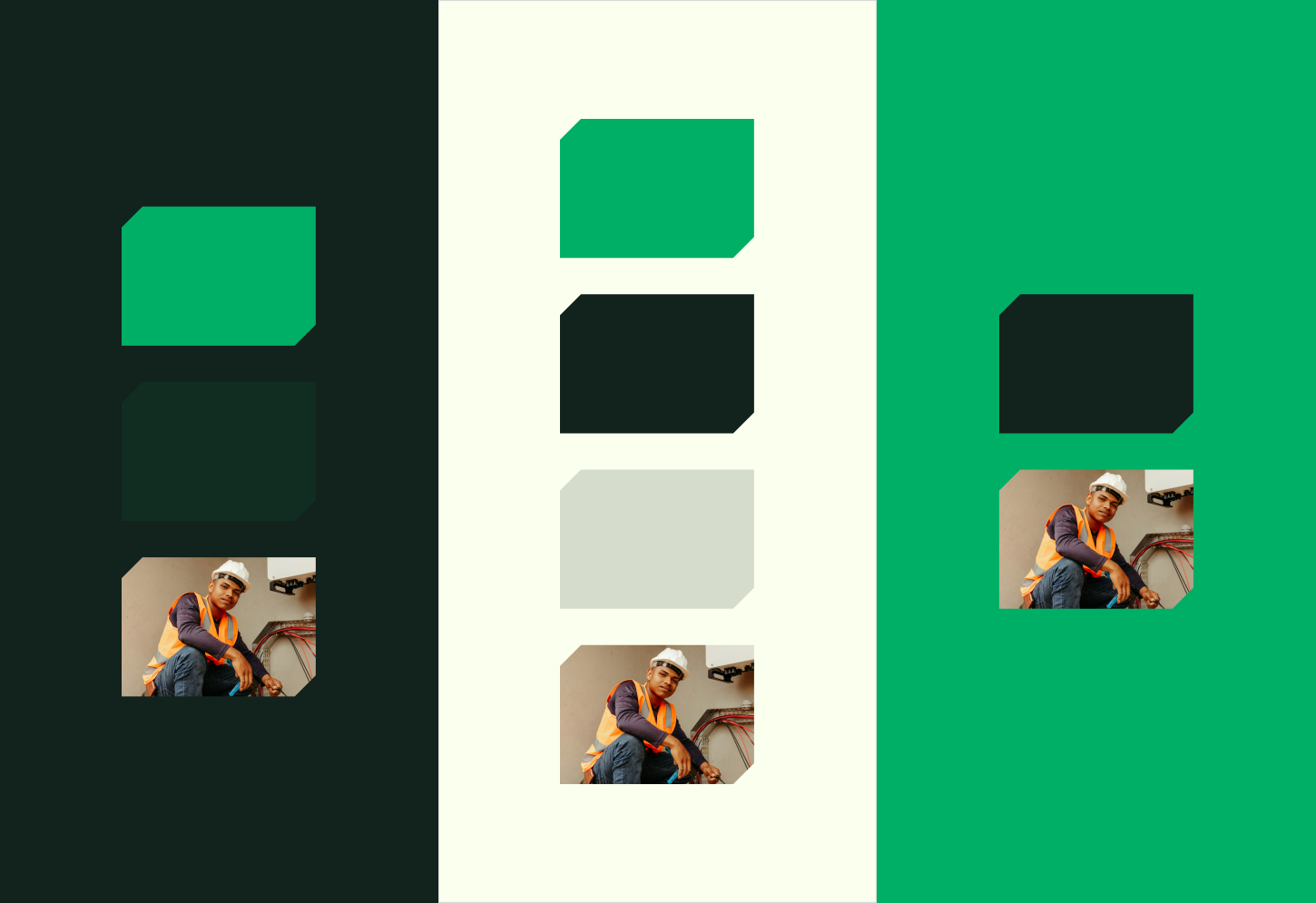
Color Applications
BuildOps colorways are designed to balance contrast and cohesion. Start with one dominant field color, then layer supporting shapes and typography using approved pairings to establish structure and hierarchy.
In situations where high contrast isn't required, closely matched tones may be used to create quieter compositions — allowing graphics to act as a grounding framework rather than a focal point.
When photography is present, choose colorways that support and frame the image without competing for attention. Stick to approved combinations to ensure every layout feels intentional, controlled, and consistent.
Examples
The BuildOps system is designed to flex across every touchpoint. These examples highlight how to combine photography, typography, and foundational graphics to create layouts that feel bold, controlled, and consistent. Use them to guide hierarchy, spacing, and color balance.
Pace-Setting Stripes
The Pace-setting Stripes are a foundational BuildOps graphic inspired by the Stripes Mark in our logo. They bring forward motion and direction to layouts — creating a clear sense of progress and momentum. Use them as a directional accent to guide the eye, or as a bold anchor that adds energy and structure across touchpoints.
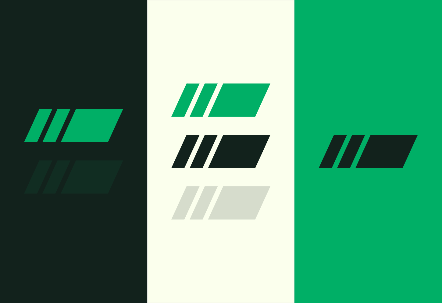
Pace-Setting Stripes — Color
BuildOps color pairings are designed to support both high-contrast emphasis and more tonal, low-contrast structure. High-contrast combinations should be used to create focus, establish hierarchy, and draw attention to primary messages. More closely matched tones may be used when graphic elements need to support layout and rhythm — acting as a grounding layer without competing for attention.
Together, these approaches allow color to flex between emphasis and support, while maintaining clarity, precision, and consistency through approved combinations.
Pace-Setting Stripes — Layout
The Pace-setting Stripes are designed to bring structure and forward motion to a composition. In layout, they should feel intentional — never decorative — supporting the content by creating a clear directional pull and a confident frame.
Stripes can be placed along the edges of a layout to anchor the canvas, guide the eye, or introduce momentum. Use them as a corner accent, a vertical edge element, or a grounding bar across the bottom of the frame. These examples show a few common placements, but the system is flexible — use the stripes wherever they strengthen hierarchy and movement.
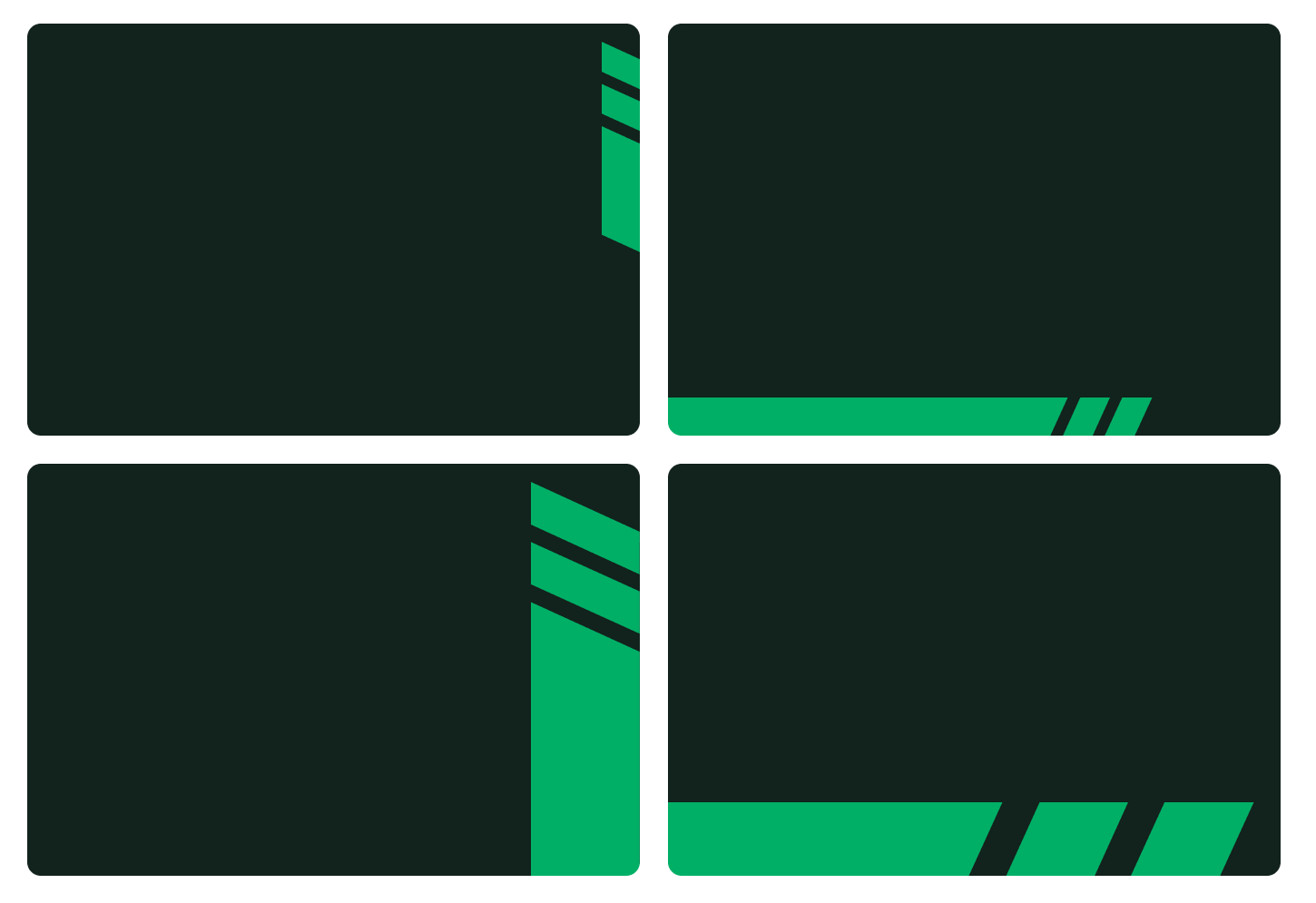
Keep placements clean and controlled. Stripes should support the message, not compete with it — leaving space for typography and imagery.
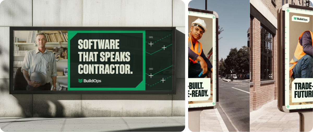
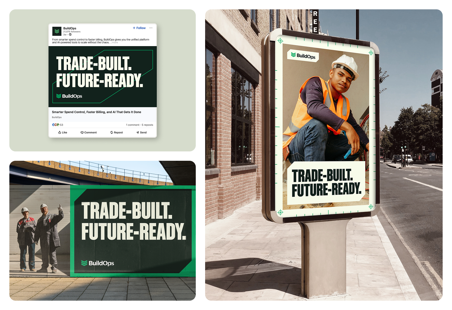
Pace-Setting Stripes — Examples
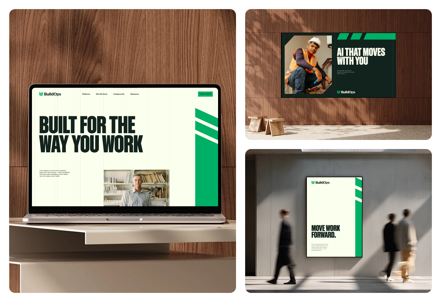
These examples show how the Pace-setting Stripes integrate seamlessly across digital and physical environments. From web interfaces to large-scale signage, the stripes add structure and momentum while adapting to different formats and contexts. Use these references to understand scale, placement, and balance — not as fixed templates, but as proof of how the system flexes.
Precision Graphics
Precision Graphics are inspired by the visual language of interstellar research, while honoring the accuracy, discipline, and craftsmanship of the trades. They balance technical rigor with bold simplicity — creating visuals that feel advanced, confident, and grounded in real work.
Built from precise shapes, linework, and modular systems, these graphics suggest control, clarity, and foresight. They reinforce BuildOps as the unifying command center for the trades — bringing complex operations into focus through structure and intention.
Because of their high-touch nature, Precision Graphics should be used selectively in campaign moments, flagship storytelling, and elevated brand expressions. They are not meant to appear everywhere. Use them when the work calls for depth, sophistication, and a heightened level of design intention.
📐
Brand Team Access Required
Precision Graphics are maintained as Figma source files. Contact the BuildOps brand team for resources, permissions, and design support.
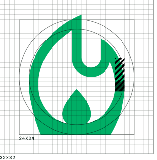
Precision Marks
These are the foundational graphic elements for the different Precision Graphics. They express accuracy and control, incorporating precision markers and measurement-inspired details that reinforce BuildOps as intelligent, precise, and grounded in the trades. These elements should be applied sparingly — used only when they add storytelling value.
Green on Light
White on Dark
Measurements
Precision Measurement 01
Precision Measurement 02
Lines
Solid Line
Dashed Line 01
Dashed Line 02
Precision Markers — Thin
Precision Marker — Thin 01
Precision Marker — Thin 02
Precision Marker — Thin 03
Precision Marker — Thin 04
Precision Markers — Thick
Precision Marker — Thick 01
Precision Marker — Thick 02
Precision Marker — Thick 03
Precision Marker — Thick 04
Number Labels
L01
L01-1
C01
C01-1
R01
Bracket Chevron
Bracket Chevron — used as a badge element for Tier 3 program lockups
Precision Chevron
The Precision Chevron is derived from the BuildOps logo, extending its core geometry into a versatile graphic system. Integrated precision marks emphasize the campaign's themes of accuracy and control, while providing a structured framework for aligning content and design elements.
The Precision Chevron is the primary campaign graphic and should be used more frequently than other patterns or graphical elements in the toolkit.
Apply it primarily as a background element to introduce depth and texture, ensuring it enhances rather than competes with core content.
Use sparingly to reinforce the brand identity while maintaining clean, focused layouts.
Adjust line weight and spacing as needed to preserve clarity and balance across different scales and applications.
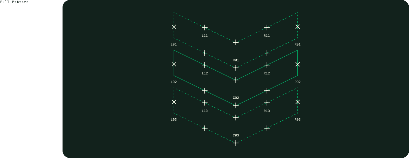
Full Pattern
Crop Examples
The Precision Chevron is designed to be cropped and framed in a variety of ways. Use different sections of the pattern to create unique compositions while maintaining visual consistency.
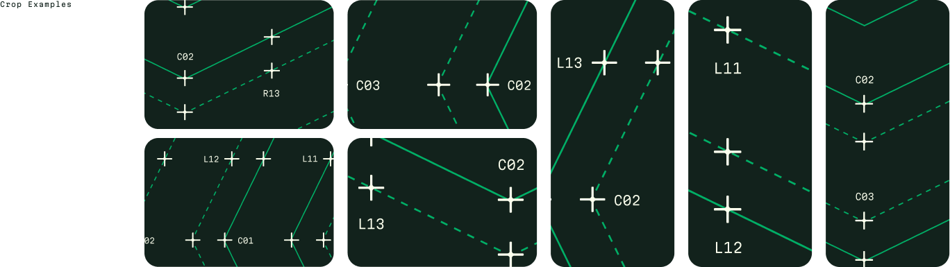
Precision Chevron Examples
01
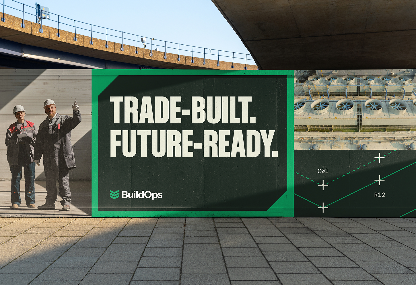
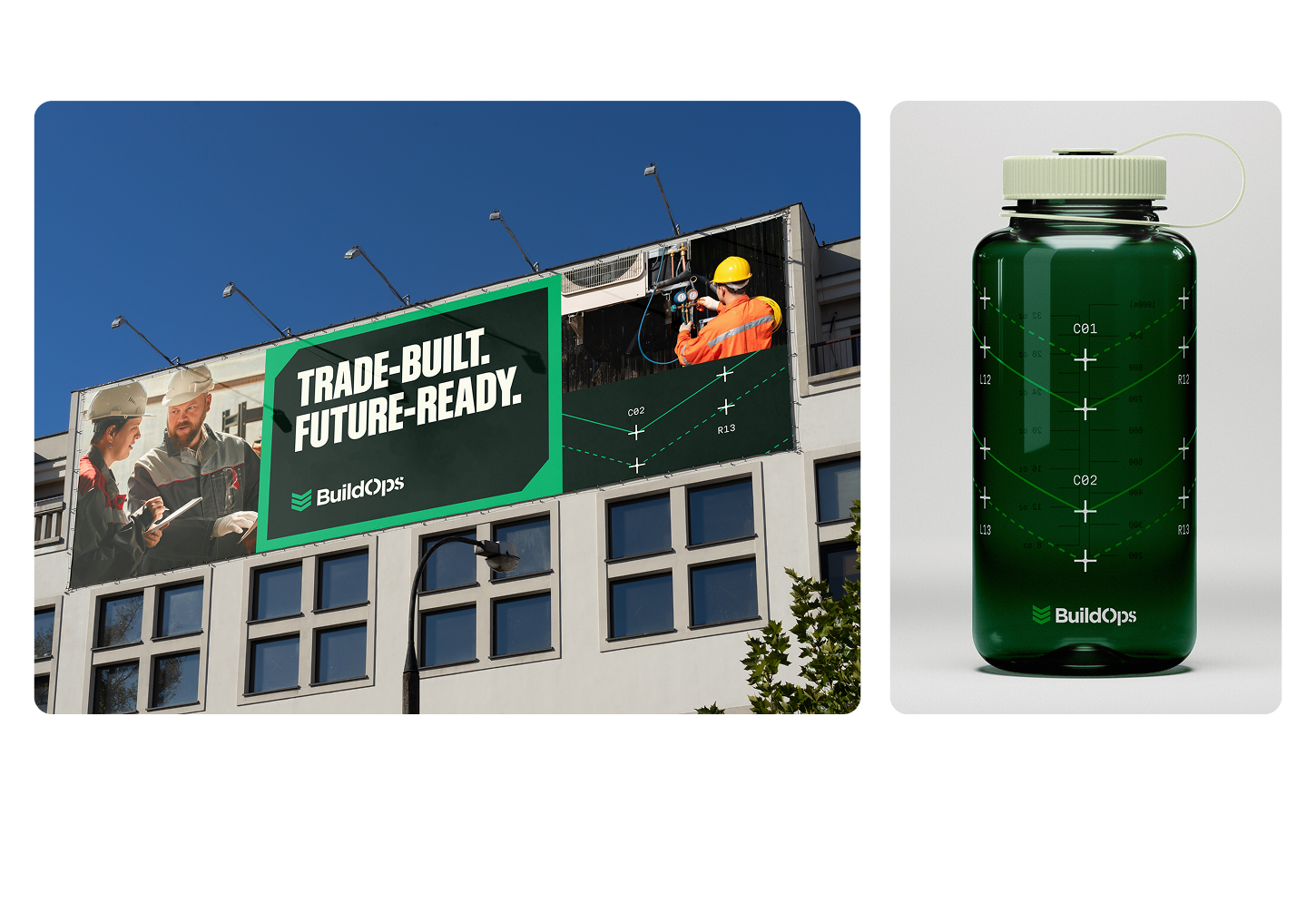
Large-Scale Advertising
Use this graphic sparingly in large-scale advertising. Headlines and photography should remain the primary focus, occupying roughly 75% of the composition, while graphics are used more subtly — about 25% — to provide structure and reinforce the campaign identity. Graphics should never compete with the message but instead act as a supporting layer.
02
Branded Merchandise
The graphic may serve as the primary focal point in applications such as branded merchandise, in order to extend campaign language. In the absence of photography or campaign headlines, it can function as a central visual expression.
Brand Team Access Required
Precision Chevron source files and crop templates are maintained in Figma. Contact the BuildOps brand team for resources, permissions, and design support.
Precision Pattern 01
This pattern uses a repeated grid of precision markers and coordinates to create a complex, modular background. Its technical aesthetic reinforces the brand's data-driven visual language.
Use primarily as a background element to add depth and texture, ensuring it supports rather than competes with primary content.
Scale and density should be adjusted to maintain clarity and avoid visual noise, especially when paired with photography or typography.
Apply sparingly in campaign graphics while keeping layouts clean and focused.
Full Pattern

Crop Examples

Standard crop — wide

Zoomed crop — wide

Standard crop — tall

Zoomed crop — tall
Precision Pattern 02
This pattern uses a repeated grid of precision squares and markers to create a structured, modular background. Its clean geometry provides a versatile foundation for layered campaign compositions.
Use primarily as a background element to add depth and texture, ensuring it supports rather than competes with primary content.
Scale and density should be adjusted to maintain clarity and avoid visual noise, especially when paired with photography or typography.
Apply sparingly in campaign graphics while keeping layouts clean and focused.
Full Pattern

Crop Examples

Standard crop — wide

Zoomed crop — wide

Standard crop — tall

Zoomed crop — tall
Iconography
Icons
Icons translate complex actions and concepts into clear, recognizable signals. In the BuildOps system, they support navigation, reinforce hierarchy, and help users quickly scan and understand interfaces and categories. Beyond function, the icon style contributes to the overall brand experience, echoing BuildOps' clarity, confidence, and operational focus.
HVAC
Electrical
Plumbing
Refrigeration
Fire & Life Safety
OpsAI
Operations
Construction & Install
Finance
Field Technicians
Mechanical
Private Equity
Owners
Sales & Marketing
Education & Trade Schools
Brand Icon Style + Anatomy
BuildOps icons are designed to feel confident, precise, and functional, reflecting the same clarity and strength found across the broader visual system. Forms are simple and purposeful, avoiding unnecessary detail while maintaining enough character to feel distinct. Consistent proportions, stroke treatment, and corner geometry ensure icons feel cohesive across sizes and contexts, reinforcing a system built for reliability and control.
Icon Elements
01
Optically consistent weight across icons
02
Legible shapes that work at small scales
03
Contrast of soft and hard edges that mimic other brand elements
04
Neutral, balanced proportions
Anatomy
Brand Icon Library
The brand icon library represents the core solution areas across the BuildOps platform — from field operations to ownership, finance, and AI-driven insights. Each icon is designed as a shorthand for a distinct capability, helping teams quickly identify products, workflows, and functional groupings across the ecosystem. Together, they form a cohesive visual language that reflects the breadth and interconnected nature of the BuildOps system.
HVAC
Electrical
Plumbing
Refrigeration
Fire & Life Safety
OpsAI
Operations
Construction & Install
Finance
Field Technicians
Mechanical
Private Equity
Owners
Sales & Marketing
Education & Trade Schools
Brand Team Access Required
Brand icons are maintained as Figma source files. Contact the BuildOps brand team for icon assets, permissions, and design support.
Icon Colorways
Icons primarily use core brand colors to ensure consistency and legibility across interfaces. Neutral icon treatments support everyday navigation, while brand and accent colors may be used selectively to indicate emphasis, status, or key actions. Color usage should remain intentional and restrained, prioritizing clarity over decoration.
Grounded Green / Precision Green
Precision Green / Grounded Green
Off-White / Precision Green
Additional Icon Source
For icons outside the BuildOps brand icon library, use Material Design Icons (Version 2) from Google. This set provides broad coverage, consistent construction, and reliable scalability across product and marketing applications.
Icons should be sourced directly from Google Fonts, where they can be searched, previewed, and downloaded.
Material Icon Settings
Style
Filled
Weight
400
Grade
0
Optical Size
24
Icons should be exported as SVGs and used without stylistic modification beyond size and color. Do not mix Material icon styles or weights, and avoid custom adjustments that introduce visual inconsistency with the BuildOps system.
Browse & Download
Search and download Material Design Icons from Google Fonts: fonts.google.com/icons
Motion
Motion & Animation
BuildOps motion reflects the discipline of precision operations. Inspired by environments where clarity and timing matter most, our motion language emphasizes direction, awareness, and momentum — helping teams see how work moves, decisions connect, and outcomes take shape. The system includes logo bumpers, background graphics, transitions, and headline animations, all designed to feel purposeful, action-driven, and built for the pace of commercial operations.
🎬
Motion Toolkit — Brand Team Access
Contact the BuildOps brand team for motion assets, animation files, and guidelines. All motion work should align with the principles outlined on this page.
Applications
Company Boilerplate
Use these standardized descriptions to represent BuildOps consistently across channels. Choose the version that fits your context.
Short Version
BuildOps is the AI-native platform for commercial contractors. It unifies service, projects, and financials into one system, with OpsAI built into every workflow — dispatching the right tech, drafting invoices, matching payments. More than 1,500 leading companies across North America trust BuildOps.
Long Version
BuildOps is the AI-native platform for commercial contractors. Built for the complexity of large-scale commercial work, it unifies service, projects, and financials into one system — from the first call to the final invoice.
OpsAI is the intelligence built into every workflow, helping teams operate with clarity when the work is on the line.
Founded in 2018 by a U.S. Army veteran, BuildOps exists to give mission-critical trades technology as strong and reliable as they are. Today, more than 1,500 leading companies across North America trust BuildOps, backed by Founders Fund, N47, Meritech Capital, and other top investors.
Short Version
G2, Capterra, social bios, speaker intros, partner pages, sales and investor conversations, events
Long Version
About pages, investor decks, formal company descriptions
Swag
Swag is an extension of the BuildOps brand system into the physical world. Through considered materials, graphics, and messaging, it reinforces focus, craftsmanship, and operational pride — turning the brand into something crews can wear, use, and stand behind.
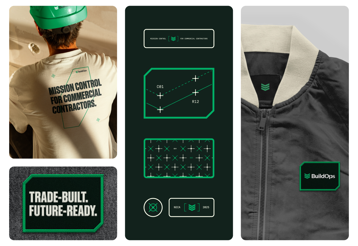
Brand Team Access Required
Swag designs and production files are maintained by the BuildOps brand team. Contact them for approved templates, vendor specs, and ordering support.
Virtual Backgrounds
Zoom and Teams backgrounds extend the brand into every meeting. Three approved treatments are available — each works for different contexts. IT manages background deployment; reach out to the brand team to request access or add new backgrounds.
Access & Requests
Virtual backgrounds are managed by IT. To request installation or submit a new background for approval, reach out to the brand team. Do not use unofficial or unbranded backgrounds in external-facing meetings.
Social Backgrounds
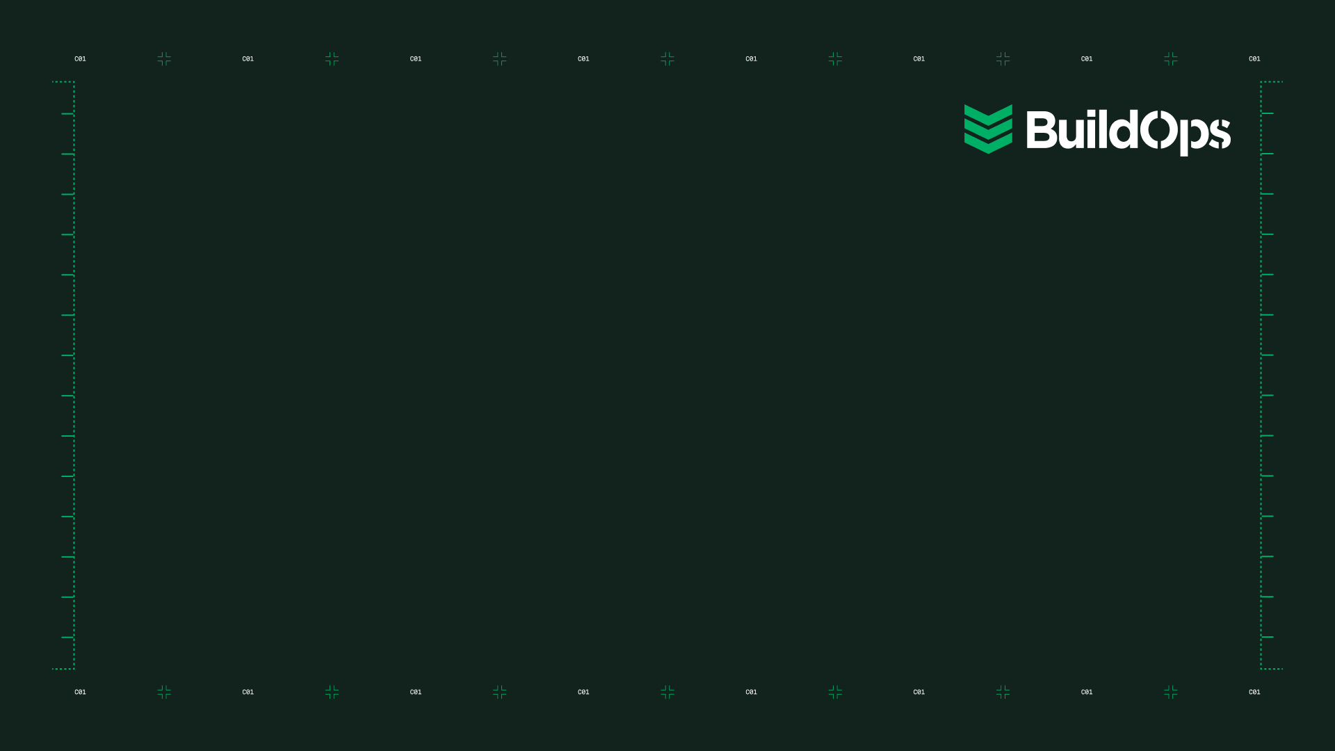
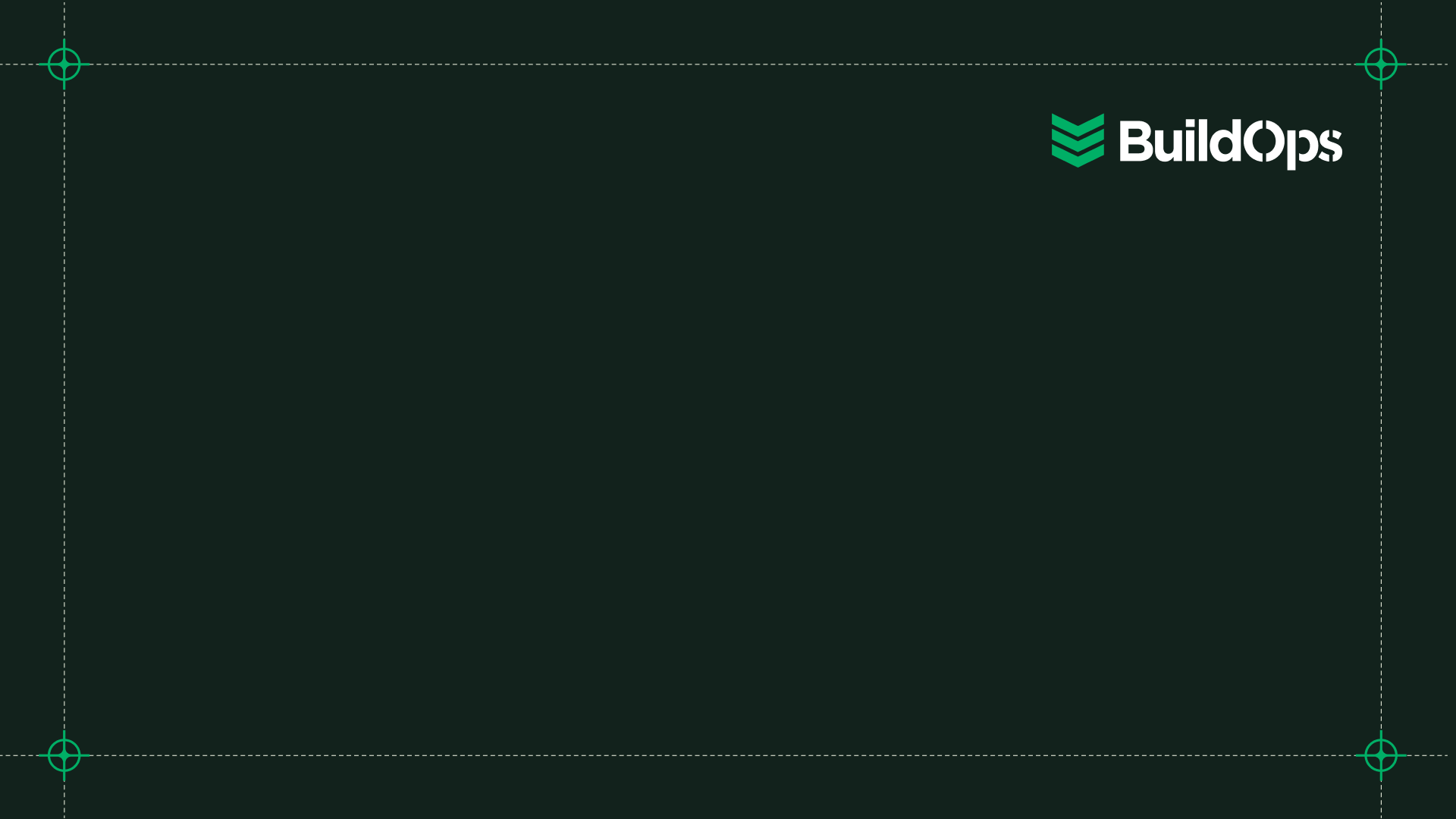
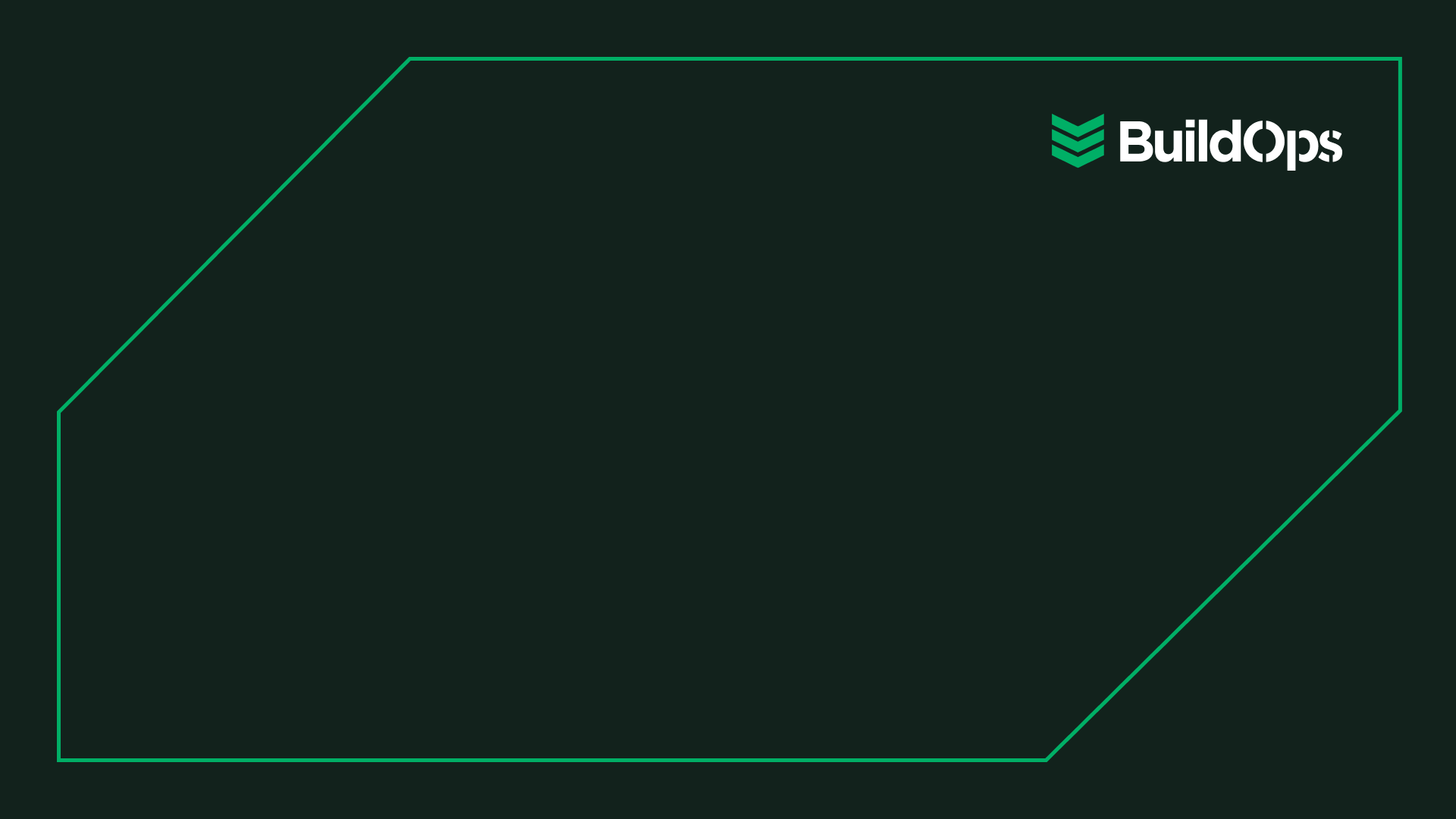
Three approved LinkedIn banner treatments — each uses a different element from the precision graphic system. All are 1584 × 396px. Use whichever treatment fits the moment.
Treatment 01 — Precision Marker Grid
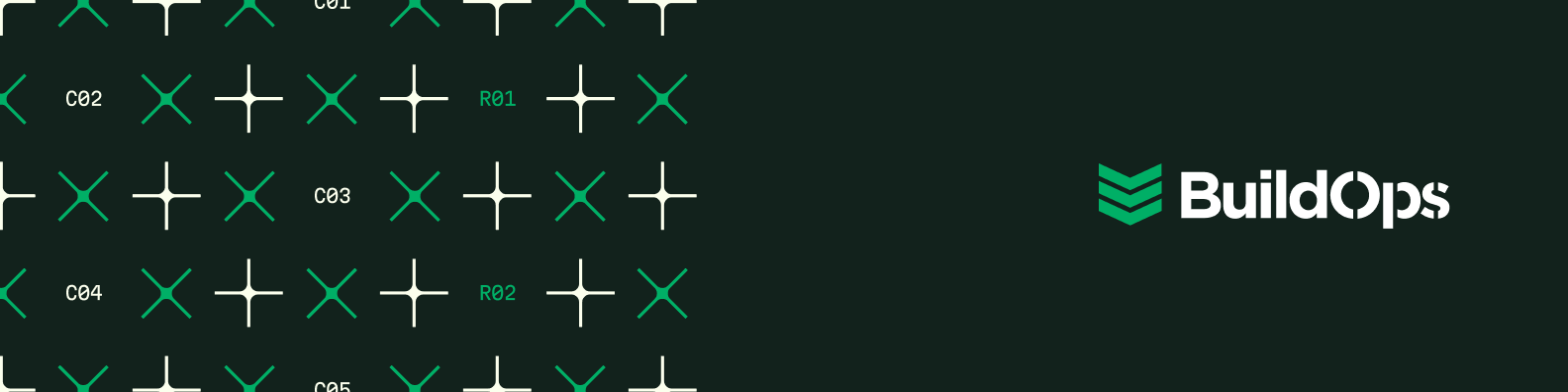
Dense marker field (×, + and bracket markers) with MartianMono coordinate labels across the left zone. Logo isolated right. Best for general brand awareness and always-on presence.
Treatment 02 — Precision Chevron on Photo
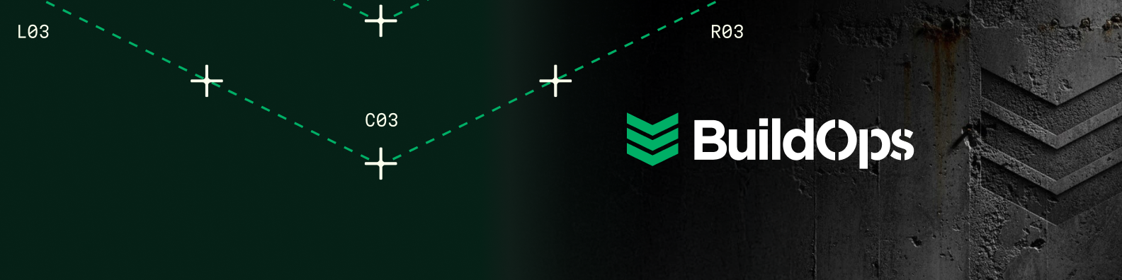
Precision Chevron dashed lines with L/C/R coordinate labels overlaid on a dark field photo. Logo center-right. Best for campaign moments, product launches, and event promotion.
Treatment 03 — Precision Chevron Clean
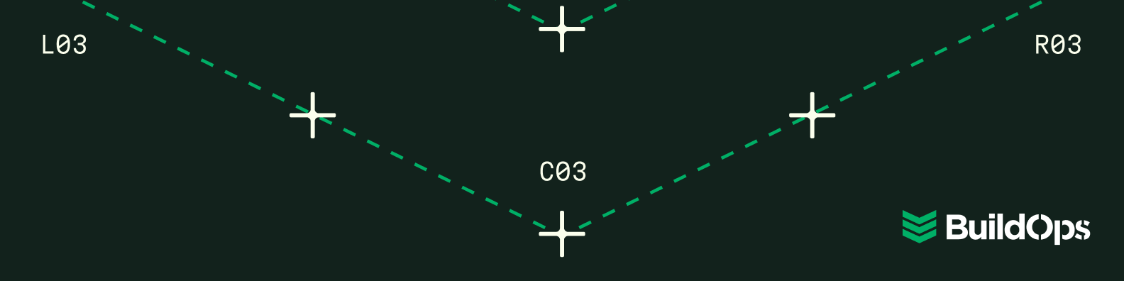
Precision Chevron on pure Grounded Green — no photo, full precision system. Coordinate labels L03/C03/R03, crosshair markers. Logo bottom-right. Most technical, most brand-disciplined treatment.
Sizing: All banners are 1584 × 396px. LinkedIn crops on mobile — keep key elements in the center-safe zone. For other platforms, see the brand team for adapted dimensions.
Brand Team Access Required
Editable source files for all three banner treatments are maintained by the BuildOps brand team. Contact them for Figma files, copy variations, and adapted sizes for other platforms.